An iconic new visual identity for the Canadian Council for Refugees
We're so proud to unveil our new image! Following the organization's strategic planning and new communications strategy, the redesign of the visual identity is a reflection of the CCR’s dedication over the years, and commitment to provide more effective communications to serve the needs of refugees, migrants and newcomers. The rollout will happen across all of our platforms, with a website transformation launching in August.
About the ideation
Our selected design studio, Caserne met the design challenge by building a brand that is just as emblematic and bold as we’ve been in our decades of existence.

The new elements - logo, typography, icons, colours and visual ecosystem - reflect the credibility and iconicity of the CCR in the immigration sector while ensuring clear and dynamic communication. As the CCR’s strength lies in its collective energy and action, the visual identity had to be evocative, flexible, abstract enough to invite interpretation while maintaining universality for our members.
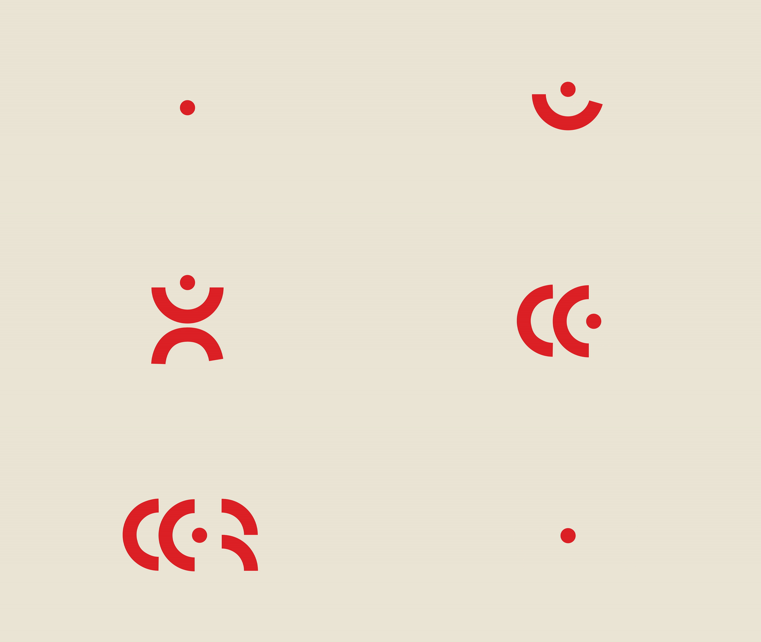
Since the information at the heart of our communications can be complex, it had to be highlighted – not overshadowed – by our new branding. The colour red was chosen to remain true to our history, with a touch more vibrance. The warm black/brown and beige relay approachability, while remaining minimalistic to not take away from logo and messages. The typography is simple and institutional for the same reasons. The logo emblem was derived from an icon representing a human (as pictured above), adding a layer of liveliness and humanity to abstract shapes. This also provided the basis for the creation of a modular icon system that will be applied to key CCR topics, to create consistency and coherence diverse communications.
 |
 |
 |
